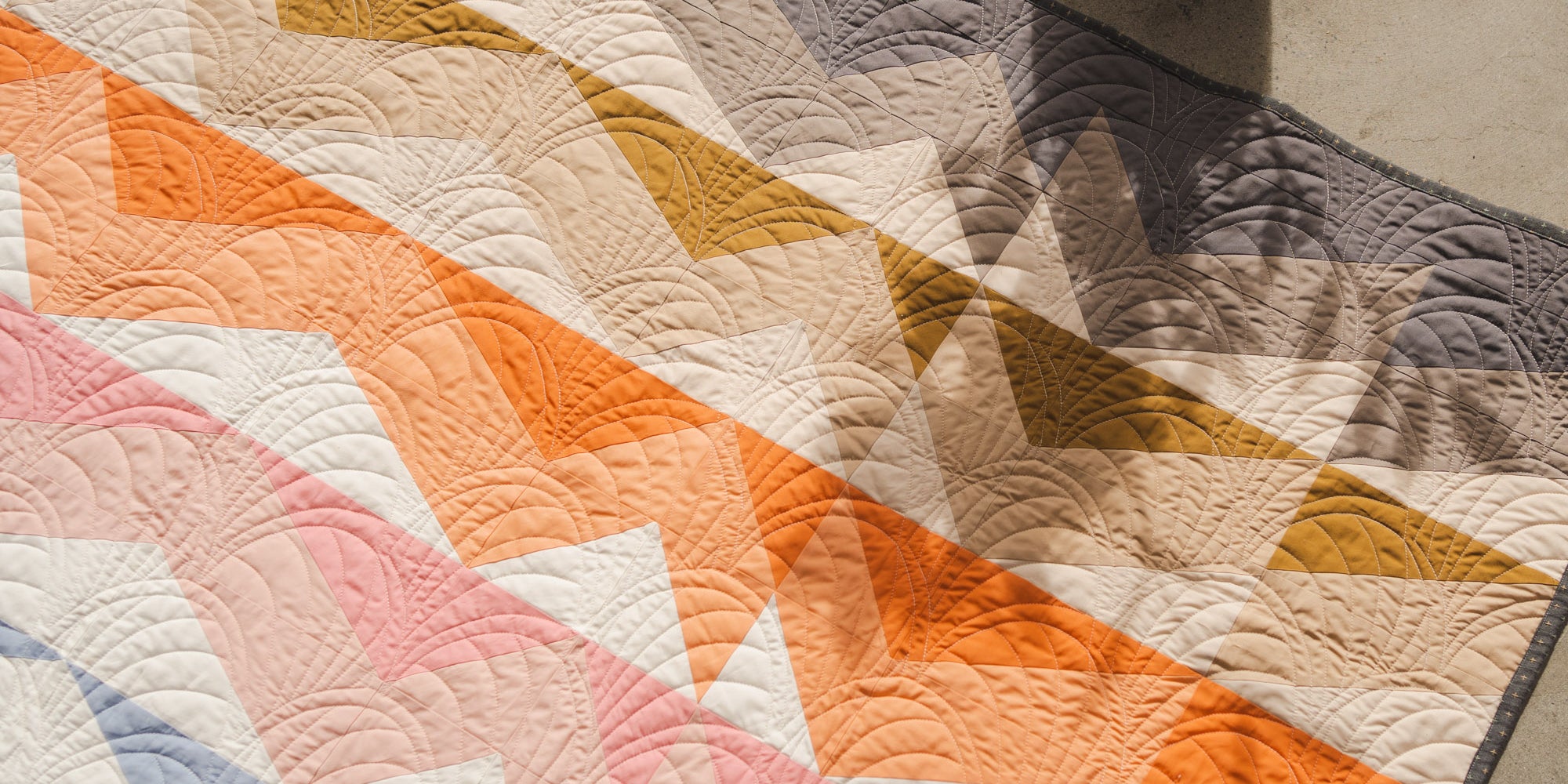

Toad & Sew’s first pattern, the New Year’s Kiss quilt, calls for nine colors. It made a splash in the quilting corner of Instagram with its bold and modern colors paired with traditional shapes. These elements became Toad & Sew’s foundation. For instance, mauve sits directly next to burnt orange in the cover version of New Year’s Kiss. It’s not a combination you always see in a time when natural palettes and soft pastels reign supreme.
Taylor Krz runs Toad & Sew, and she’s an artist first and quilter second. She has a lot to say about color theory. With a background in illustration and visual design, she’s a full-time designer for Microsoft. Taylor wants to empower quilters to make quilts that double as artwork, so she’s sharing her insights and process with us here.
Rebecca Bratburd (RB): How do you start to think about colors when designing a new quilting pattern?
Taylor Krz (TK): When I’m starting to design a quilt pattern, I typically don’t pay attention to color at all. I actually throw in random swatches, or a color scheme that I know has a range in values and tones and worked successfully in the past. It removes the whole color aspect so I can focus on shapes, values, and composition. I’m focused on how the pattern reads as a whole, then I’ll hone into the colors and figure out what kind of vibe I want. It’s a lot of plugging and placing. I’ll go through so many different color schemes.

RB: Thinking about your color schemes, what’s your usual game plan?
TK: I’ll play with one or two focal colors, depending on the pattern, then pair them with more subtle tones. I’m a fan of earthy tones. I’ll see what a quilt would look like as monochromatic, just on a blue scale or a green scale. I’ll experiment with patterned fabric as well.
RB: If there’s no set formula involving a color wheel and determining specific analogous and complementary colors, what are some color combinations to avoid?
TK: As far as what to avoid, you’ll know what doesn’t work when you see it. I avoid “pure” colors like white, black, yellow, red, purple, or green. Instead, I’ll use off-tones of these colors. Reds and greens or anything very complementary are extremely difficult to pull off without it seeming like a school mascot. That’s when you have to focus on adjusting the tones to make it work.
RB: If you’ve seen colors too often in corporate branding or sports teams, it’s a good idea to steer clear. If a quilter would like to break away from the tried-and-true fabric pulls and make their next quilt feel more modern, what would you suggest?
TK: A mistake a lot of people make is that they don’t use enough broken hues, neutral earthy tones, and other colors that aren’t obvious on the color wheel. I love a neutral background like gray, cream, or sandstone because it lets the actual colors shine, more so than a white background. White is really stark, and I only used it as an accent color in the Grove quilt. Similarly, black can be too stark, but you can achieve a darker color scheme using charcoal, navy, or slate.

RB: If someone is inspired by the colors they see on a hike, they’re not going to come home and find golds and browns on the color wheel.
TK: From there, let’s say you’re trying to pick five colors. Choose two or three colors from the color wheel, and follow it up with earthy tones and subdued values that might complement it well. I usually pick my background based on an off-tone neutral color. AGF Sweet Macadamia and other very, very subtle colors make good backgrounds.
RB: Where are good places to draw inspiration?
TK: It’s amazing to see what the quilting community on Instagram comes up with. I look to experienced pattern makers, like Suzy Quilts, especially for patterns that call for upwards of 18 colors. I love fabric and experimenting with colors I see in new fabric lines. If I need a bunch of colors, I’ll find photographs on Pinterest. This could be anything from an interior design of a living room, a stack of pretty books, or a landscape of nature.

For more inspiration, follow Toad & Sew on Pinterest for color inspo and quilt color-ways, and sign up for the Toad-Spo monthly newsletter to be the first to see new fabric bundles, mock-ups, and creative tools to empower your artistic quilt-making.