


mar. toadspo
Pantone - Fresh Salmon
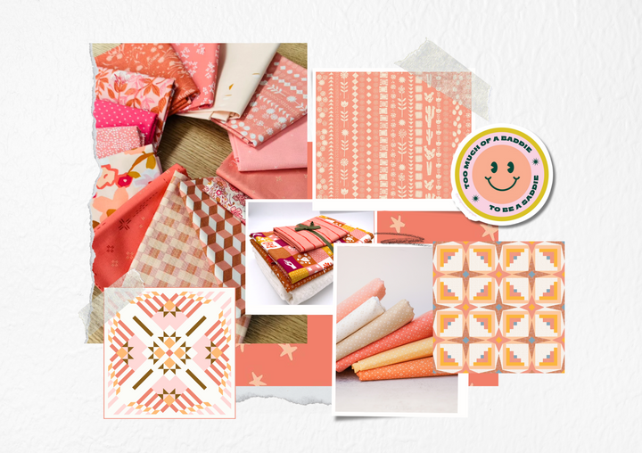
Salmon is seriously one of my top favorite colors! I've scattered it around my house, adding little pops here and there to keep things lively. It even had a starring role in my wedding color scheme! There's just something about that warm, pinkish-orange vibe that brings so much fun to any space. Right now, we're currently painting our dining room a salmon-ish color! The best way to incorporate salmon into your interior spaces is adding in a mix of natural elements such as a wood or rattan to enhance the warmth and create a cozy ambiance.
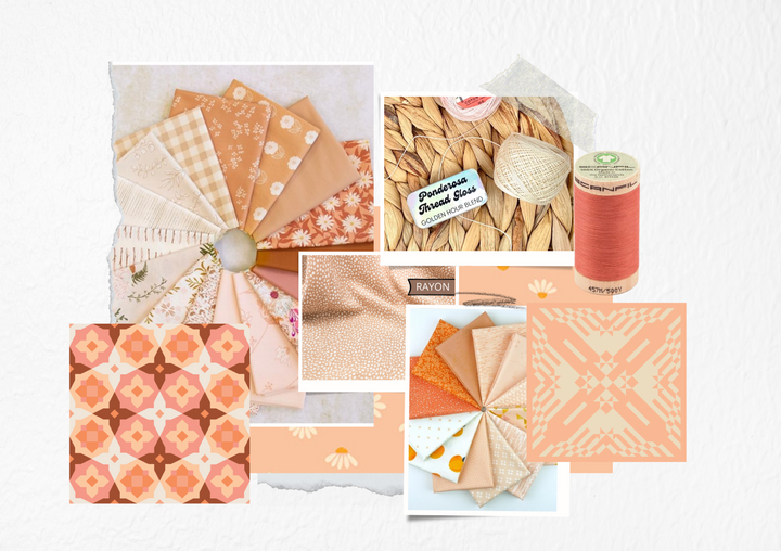
Understanding the color wheel can provide insights into which colors harmonize well with salmon. Salmon's primary components—red and orange—imply its compatibility with adjacent hues on the color wheel, such as various shades of pink, coral, peach, and terracotta. These colors share similar undertones, creating a visually cohesive palette when paired together.
Additionally, salmon's warm undertones make it an excellent complement to cooler colors, such as teal, turquoise, and mint green. This contrast creates visual interest and balance, as the warmth of salmon offsets the coolness of these shades.
For a more subdued and sophisticated look, pairing salmon with neutrals like beige, cream, or gray can create a calming atmosphere while still incorporating a pop of color. These neutral tones provide a backdrop that allows salmon to stand out without overwhelming the space.
So yeah, you can say I'm pretty pumped about this dining room makeover. Can't wait to show you how it all comes together!

Products
This year, our friends are joining forces with us to showcase products that complement the Toadspo color of the month! Explore the exciting offerings they have in store for you!
Toadspo Partners:
- Lamb & Loom Fabrics **
- Floyd the Fox ** (ships from Germany)
- Wyldwood Creative **
- Full Moon Fabric Co. **
** Partners offering a 10% discount on featured Toadspo products! Use code TOADSPO10 at checkout on their site.
Color Schemes
Fresh Salmon is truly such a versatile color to build color palettes around. This color alone is bold and bright and playful. Colors palettes including Fresh Salmon can be subtle or full of life! Check out the 3 color palettes I came up with below!
COLOR SCHEME I
Berry Blitz
The Berry Blitz palette, with its sophisticated wines and gentle pastels, is versatile for quilting, capable of creating both bold statements and soft whispers in fabric form. It's particularly well-suited for quilts intended to convey a sense of warmth and comfort, such as throws for cozy evenings or elegant wall hangings. The colors are also reflective enough to be used in seasonal projects, with the deeper tones fitting for autumn or winter quilts, while the lighter shades would be lovely in spring or summer creations.


COLOR SCHEME II
Summer Boardwalk
This palette, with its interweave of refreshing aquatic blues and cozy reds and pinks, is dynamic yet harmonious, presenting a contemporary and invigorating charm ideal for seaside-inspired quilts. The range of colors is versatile enough for summer and the coastal quilts, as well as for those that like a little maximalism in their life!
COLOR SCHEME III
Fairy Garden
The Fairy Garden palette draws inspiration from nature, with a focus on colors that would appear during the transition from late summer into autumn. The use of both vibrant and muted tones allows for such a versatile quilt, providing options for both bold statements and understated elegance.


